

Accessible airports are reshaping the ‘for all’ passenger experience

Airports are moving accessibility from compliance to core strategy. The best hubs plan for a wide range of physical, sensory, and cognitive needs, then design the journey to work without constant requests for help. When wayfinding is clear, routes are barrier free, staff are trained, and information is easy to use, more people travel independently and with less stress. That improves service for everyone, not only for passengers with disabilities.
Accessibility is now a design lens rather than an add-on. Terminal planners use it to make decisions about circulation, seating, lighting, acoustics, signage, and digital tools. Customer teams use it to shape assistance services and staff training. Technology teams use it to connect apps, kiosks, and real-time information. When these elements align, the airport experience becomes predictable and humane.
What accessibility means at an airport
Airports are complex. A single trip can involve curbside drop-off, check-in, security screening, border control, long concourses, gate changes, and boarding by bridge or bus. Each step can be a barrier if the design assumes a narrow range of abilities. True accessibility widens that range.
Wayfinding and information: passengers need consistent symbols, readable typography, high contrast color, logical line of travel, and audio or visual alternates. Good wayfinding reduces the need to ask for help and lowers anxiety during disruptions.
Routes and facilities: step free paths, ramps within proper gradient, elevators that are easy to find, seating with maneuvering space, counters at inclusive heights, and restrooms with adult changing facilities where possible.
Communication and service: trained staff who understand mobility support, respectful assistance, simple language, and options for people with hearing or vision loss.
Technology: mobile apps and kiosks that present clear information, announce changes in multiple formats, and allow a passenger to request help without hunting for a desk.
These principles apply across the journey, from curb to gate and from gate to exit on arrival.
The rise of universal design
Universal design is the idea that a place should work for the broadest set of users without special adaptations. Airports that use this approach do better on two counts. First, travelers with disabilities encounter fewer obstacles. Second, families with strollers, older travelers, and people moving with luggage benefit from the same features. Wide sight lines and clear signs help a parent with a toddler as much as a passenger with low vision. Quiet rooms help someone with sensory sensitivity, and they also help any traveler who needs a calm space before a long flight.
Case studies, five hubs that set a useful standard
Tokyo Haneda, consistent support across the process
Haneda treats accessibility as routine. Dedicated assistance points are visible, the request process is simple, and staff have clear roles. Priority seating and fully accessible restrooms are spread through the terminals, not hidden in one location. The airport recognizes the Sunflower Lanyard program for hidden disabilities, which lets passengers signal a need for patience or extra help without disclosing medical details. Multilingual signs and announcements support international visitors. The value here is consistency, the same standards appear at check-in, security, and the gate.
Notable elements: PRM assistance points, hidden-disability recognition, wheelchair services on demand, multilingual wayfinding.
Singapore Changi, seamless routing with quiet space
Changi pairs barrier free layouts with legible information. Long corridors are punctuated by rest areas, floor transitions are smooth for wheelchairs, and elevators are easy to locate near escalators rather than out of the way. Private rest spaces and quiet rooms give travelers a break from noise. Assistance is available on request, and the handoff from one team to another is designed to be visible to the passenger, so the traveler does not feel lost between checkpoints.
Notable elements: barrier free circulation, quiet rooms, multilingual wayfinding, requestable assistance.
Zurich, service precision and clear layouts
Zurich puts emphasis on predictable handoffs and trained personnel. Mobility services have set response times, routes to security and border control are logical, and staff receive regular instruction on assisting people with hearing, vision, or mobility needs. Seating areas include options with extra maneuvering space, and restrooms are designed for access and dignity. The layout helps first-time users build a mental map quickly.
Notable elements: mobility fast track, accessible seating and restrooms, trained multilingual staff, intuitive terminal maps.
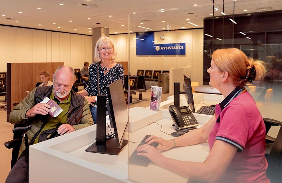
Amsterdam Schiphol, quick help on demand
Schiphol makes assistance easy to request. “Assistance Point” kiosks are placed where travelers actually need them, near entrances and decision points, so a passenger can ask for support without walking the length of a hall. Wide concourses reduce conflicts between moving pedestrians and wheelchairs. Quiet lounges and clear signs support people who need extra time or calm surroundings. The airport aims to keep wait times stable even during peak disruption.
Notable elements: Assistance Points, wide walkways, quiet lounges, consistent signage.
Manchester, steady upgrades and staff capability
Manchester has invested in accessible check-in options, improved restrooms, and training. The focus is on clean handoffs, from curbside to check-in, from check-in to security, and from security to the gate. Staff are trained to guide, not to take over, so the passenger remains in control of the journey. Visible guidance at key decision points helps reduce last-minute sprints and missed boarding calls.
Notable elements: dedicated check-in choices, accessible facilities, enhanced staff training, clear guidance.

How airports make this work behind the scenes
Journey mapping
Airports that excel at accessibility map the journey in detail. They test routes at different times of day and with different user profiles. They check elevator placement, slope, lighting, ambient noise, and signage from the perspective of a wheelchair user or a traveler with low vision. They remove clutter that blocks a cane path, and they standardize where information appears, so screens and signs build on each other.
Training and culture
Policies are not enough. Staff need practical skills and a clear script for help. That includes how to offer assistance without pressure, how to communicate with a deaf traveler, how to guide a person with low vision, and how to manage a request for more time at screening. Refresher sessions keep the skills active and reduce variation between shifts.
Technology and data
Kiosks, apps, and real-time systems can either help or confuse. Good practice keeps interfaces simple, with large touch targets, high contrast, and plain language. Real-time alerts should appear in multiple formats, visual and audible, and should be consistent across the app, the website, and the departure boards. Airports that track assistance requests, response times, and missed connections can spot weak points and fix them.
Partnerships and feedback
Airports that improve fastest invite disability organizations, caregivers, and frequent travelers to test changes before they go live. They collect feedback after disruptions, not only on calm days, and they publish what they learned. That builds trust and gives teams a concrete list of priorities for the next quarter.
Features that matter across disabilities
For mobility: step free routes, ramps within standard gradient, elevators near escalators, loaner wheelchairs, and pre-boarding that is organized and respectful.
For low vision and blindness: tactile paving at key decision points, high contrast signage, braille where useful, audio announcements that match on-screen information, and staff trained in sighted guide techniques.
For hearing loss: visual paging, induction loops at counters where possible, captioned safety videos, and written alternatives for key announcements.
For neurodiversity and hidden disabilities: quiet rooms, predictable routines, clear pre-travel information, the option to signal a need for patience, and sensory maps that show noise levels and lighting changes.
For medical and personal care needs: restrooms with adequate turning radius, adult changing facilities where feasible, and clear policies for assistive devices and service animals.
Three trends are shaping the next phase.
Personalized assistance at scale: apps will allow passengers to share needs in advance, choose meeting points, and receive step by step guidance, with privacy options. Airports will connect these requests to staff rosters to reduce waiting and missed handoffs.
Design that is both sustainable and accessible: energy efficient systems can coexist with inclusive layouts. Lighting plans will balance efficiency with visual comfort, and materials will reduce glare and echo that make navigation harder.
Continuous testing with users: more airports will move from one-off audits to ongoing usability sessions. Small, frequent tests catch problems early and cost less to fix.